Friends of the Review,
Here a rat, there a rat, everywhere a rat. Kate Wagner’s tribute to union icon Scabby the Rat, who this past summer survived yet another extermination threat, has provided our new issue with our first mascot of sorts (thanks goes to illustrator Angela Sun). In July the National Labor Relations Board upheld the use of the twelve-foot-tall inflatable rodent in acts of free speech, dismissing a complaint that alleged that Scabby, with his menacing visage and all-around dank habitus, was bad for business. Not just as a symbol of organized labor, but as a critic, fighting for those, Wagner writes, “who need anger and shame as a weapon, to cut through the noise,” Scabby brings accountability to architecture.
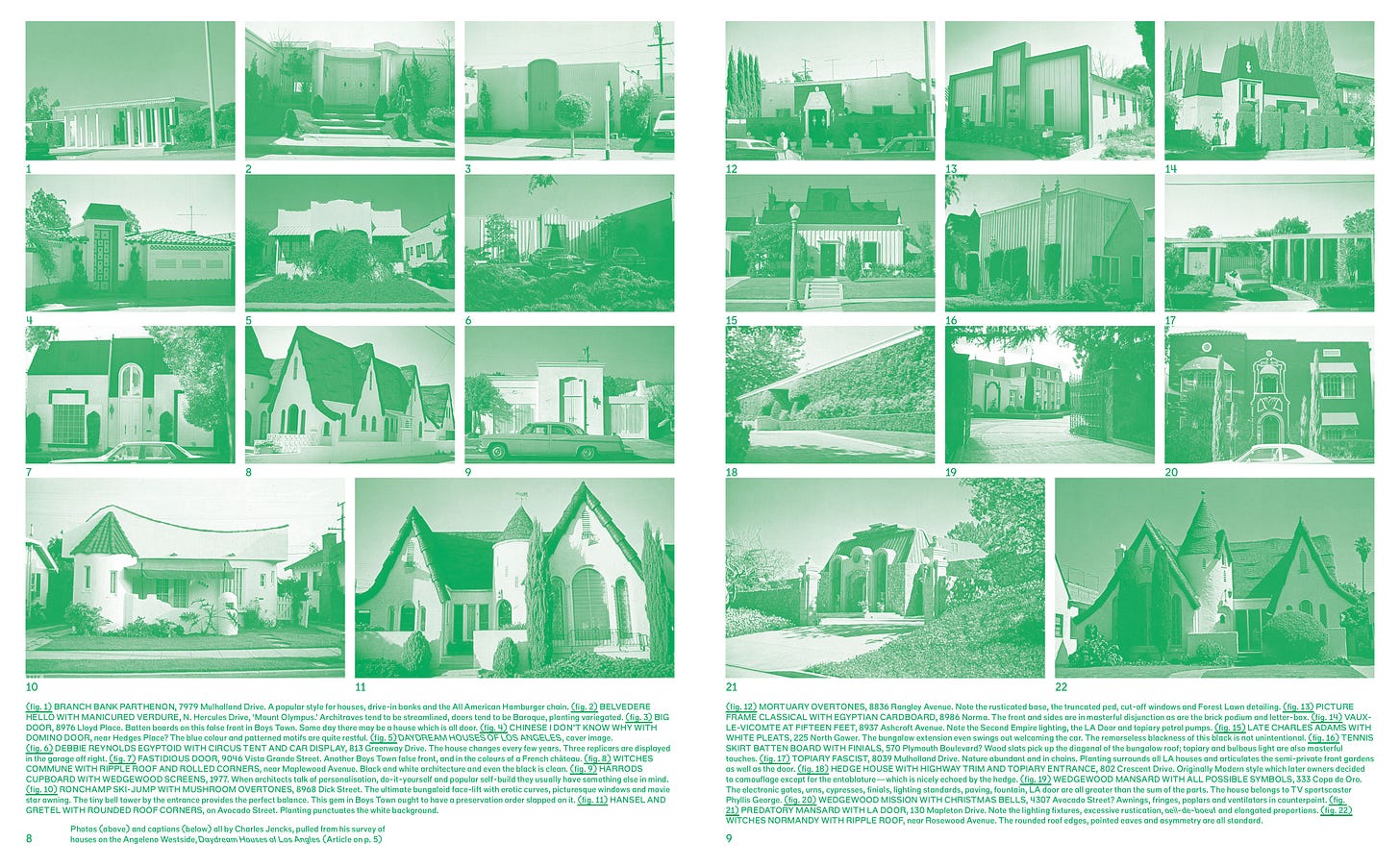
Scabby is liable to turn up in all over our new issue, #22, which we are excited to be sending to press. Collaboratively edited and designed by Laura Coombs, it features reviews and essays from Shane Reiner-Roth, Kate Wagner, Palmyra Geraki, Anna Talley, Anna Gibertini, Jonah Coe-Scharff, Enrique Ramirez and Phillip Denny, with a centerfold of photos from a book by Charles Jencks reviewed by Anna Kats, and a full spread print by Michael Meredith.
Subscribe to receive your copy here.
Like all of our issues, #22 is a limited edition Risograph print by the team at a83. If you are a current subscriber, you can look forward to receiving your copy in the mail soon. If you're not a subscriber, subscribe today, and we will put a copy of #22 in the mail for you. Read on below for some excerpts!
In the Issue…
FIRED UP: SHANE REINER-ROTH ON MIKE DAVIS’S LOS ANGELES
Banham’s vision of a sprawling “instant city” glossed over the slow violence of urban development and abuse of state power that had been unfolding for decades a few miles south of Central Los Angeles... This cultural divide… had been laid bare for all to see by the Watts riots, a six-day uprising in August 1965 that began on the streets of the South-Central neighborhood of Watts and later spread throughout the city and the global media sphere along with it.
FEVER DREAM: ANNA KATS ON CHARLES JENCKS’S LOS ANGELES
The original building, the one memorialized by Jencks, might as well be dead. The current iteration might as well be dead to me....
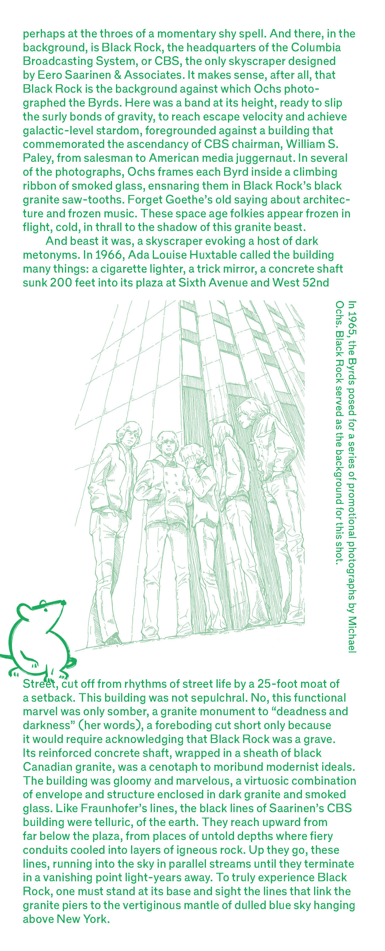
ENRIQUE RAMIREZ: BLACK ROCK, OR: GOODBYE, TWENTIETH CENTURY
Back in the 1960s, Paley and CBS president Frank Stanton commissioned Eero Saarinen to design a new kind of office building, imposing and bespoke, architecture befitting not just the network’s prestige, but also blazing new paths for skyscraper design. It was a building dedicated to a company that monetized the electromagnetic spectrum first by purchasing radio stations, then by brokering and monopolizing multiple licenses for ultrahigh-frequency bands for radio and television channels, and finally by embracing color television as the medium of the near future.
SCABBY KNOWS THE TRUTH: KATE WAGNER ON ARCHITECTURE’S BEST CRITIC
Scabby the Rat is my favorite architecture critic. No, really, I’m serious. No one embodies the spirit of criticism in all its playfulness, its combativeness, its under-sung and decidedly on-the-ground quality. One often forgets that protest is also criticism, perhaps the purest form of criticism there is.
PALMYRA GERAKI: THE STAKES OF THEORY
It’s no surprise that the central concern of Theory’s Curriculum, a book written by theorists for theorists, should be about theory’s wellbeing. But what is it that troubles theory?
ANNA TALLEY AND ANNA GIBERTINI: ENGINE FAILURE
Everything from the Biden administration’s infrastructure plans to the roiling debate about the safety of self-driving cars and Silicon Valley’s machinations is evidence that, as a country, we’re not ready to end our relationship with the automobile, despite its ecological toxicity and inefficiency versus public transportation… None of this felt apparent at MoMA’s Automania.
JONAH COE-SCHARFF: PERSPECTIVAL UNREALISM
Name any cliché about architecture and perspective, and the drawings by the Bibiena family on view at the Morgan Library & Museum promise to explode it. Perspective often is said to be the drawing of realism; here it is the drawing of fantasy. Perspective is for a final rendering; here it is a designer’s working drawing. Perspective, art historian Yve-Alain Bois once wrote, “petrifies the viewer” like the glare of Medusa, by implying an immobile point of view. Yet the Bibiena drawings animate their spaces as if through parallax, with layers of depth poised to spring into motion.
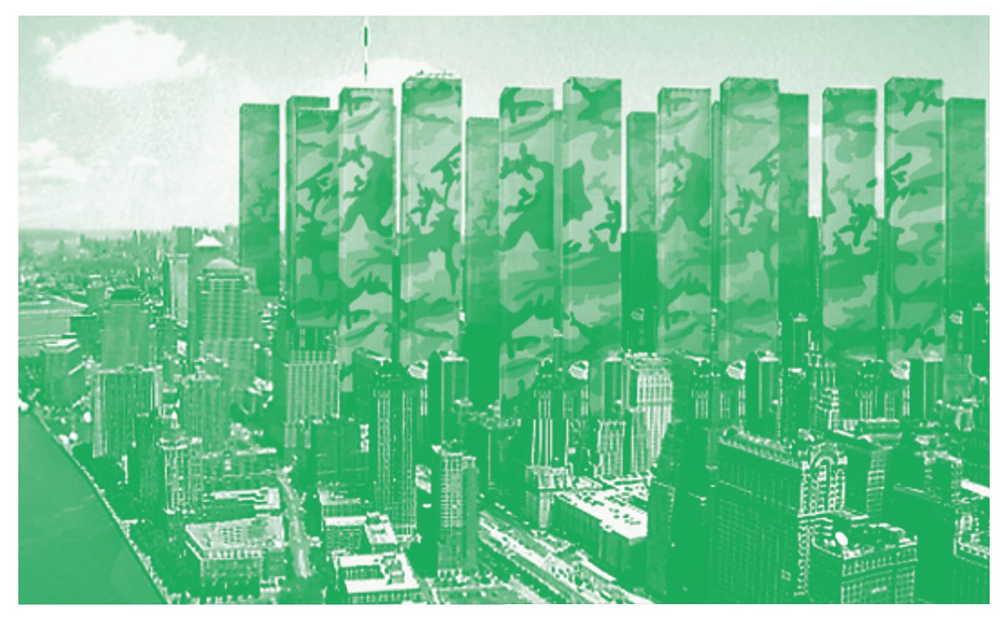
PHILLIP DENNY: CAMOUFLAGE
Here, the lost Twin Towers are reincarnated as many towers, all cloaked in blue-gray camouflage and huddled around the vacant World Trade Center site like a mourning family. It is a sly image that these days nevertheless strikes a melancholic tone. It inverts the generic expectations of a memorial.
Skyline!
After Hood had accepted the award and left the improvised stage, a Harlem resident stood up and offered an impromptu speech. “I’m proud of you, and I don’t even know you,” she said to Hood… - A.L. HU
To support our contributors and receive #22 by post, subscribe here.
Four desk editors run NYRA: Alex Klimoski, Phillip Denny, Carolyn Bailey & Nicolas Kemper (who also serves as the publisher). They rotate duties each month.


