Issue 54. If someone forwarded you SKYLINE, sign up here to receive it weekly.
SKETCHUP CONTEMPORARY
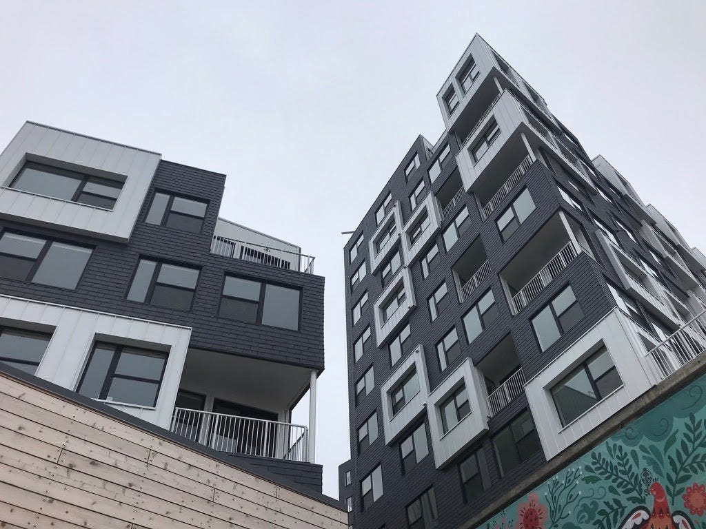
Late last year, Ian Volner pointed out in Metropolis that no one talked about 2021’s building boom. It’s true. New construction continues to pop up everywhere, often taking a familiar form: SketchUp Contemporary.
On the surface — just the surface — these buildings present a kind of modern or sleek aesthetic, eschewing the complex detailing and ornamentation of old in favor of a sparse, simple use of bricolage material applied without regard for structural or aesthetic logic. Formally composed of extruded boxes, with the occasional folded plane, they appeal to a potential resident who is enamored with the minimalism of the iPhone, with Dwell spreads of ascetic, white interiors featuring a single yellow Eames fiberglass chair, with the inside of coffee shops that look like Apple stores. It is the image of high design, without any of the quality or consideration.
This image, for many, has come to represent the style of gentrification. Buildings designed in this fashion — quickly, carelessly, with little regard to construction — are appealing to big developers not only because their image appeals to their target demographic, but also because their design allows them to minimize costs while maximizing rentable area, thereby increasing their profits.
This week, SKYLINE contributors participate in an architectural neighborhood watch and send reports on what’s going up where they live.
— Marianela D’Aprile and Keefer Dunn
NEIGHBORHOOD WATCH
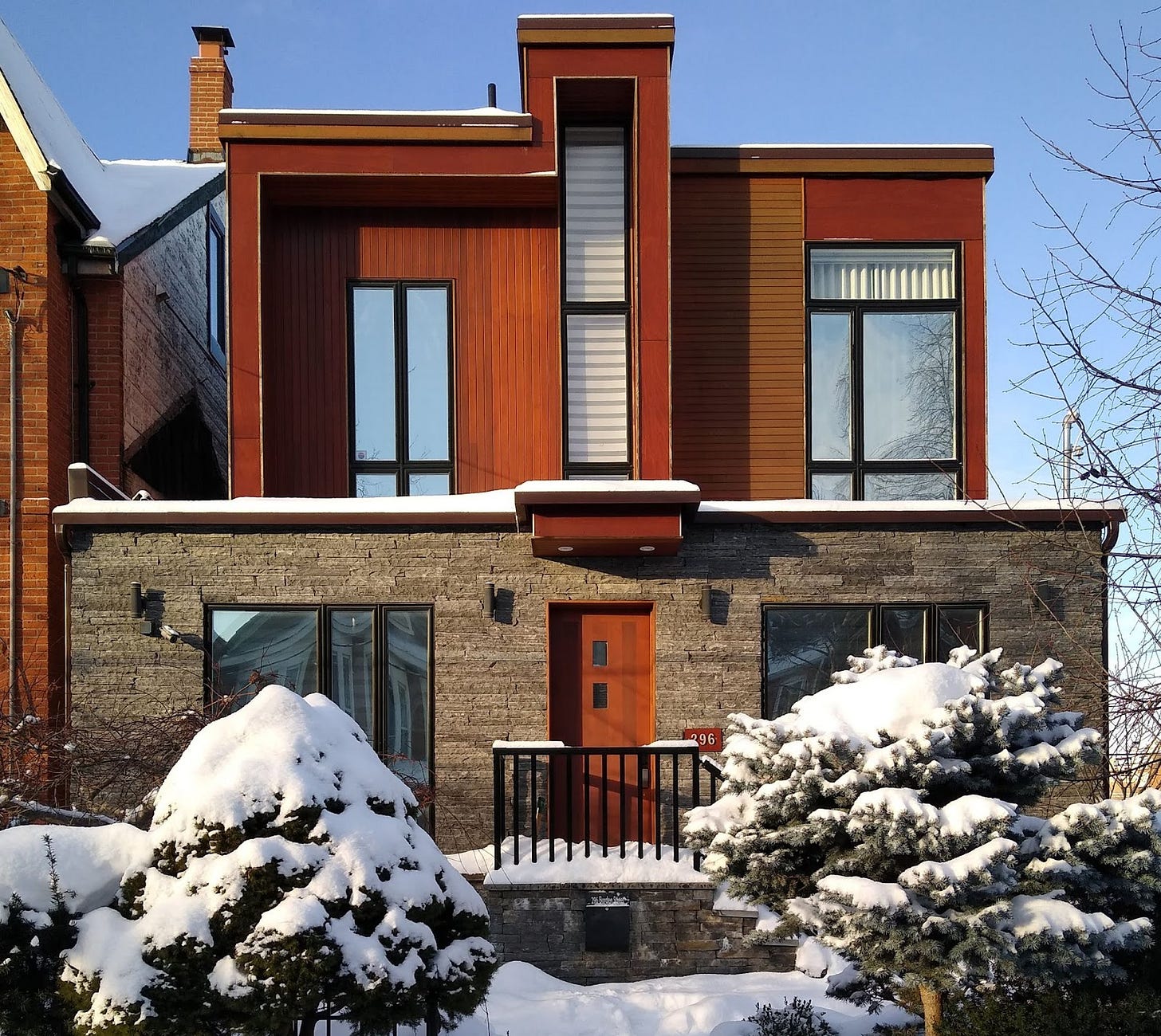
In Toronto’s Annex (once Jane Jacobs’s neighborhood), in the midst of rows of semi-attached Victorians and their lingering post-war equivalents, a blight spreads. With their basic blocky, tacked-on geometries — surely they must have looked Dwell-modern on the screen — these new buildings age, after a single grueling winter, exactly as old Ikea furniture left outside would. Think warping and delaminating. They give weathering a bad name. A glimmer of hope: the sharp new houses around here are experimenting with brick.
— Matthew Allen
I would love to see SketchUp Contemporary buildings here in Seattle because that would mean more houses! From Wallingford, Seattle you can stare at downtown from most people’s doorsteps, but the only building happening is one-for-one replacements of 1920s box homes and worker bungalows with bigger modernist boxes or Pinterest farmhouses. Meanwhile, walk three blocks over to I-5 (that’s a highway, East-Coast friends) and you can see the results: people are building houses here, too. It's just housing of last resort approximated out of tents and tarps in the hostility of public space. I’d take SketchUp Contemporary over that.
— Xio Alvarez
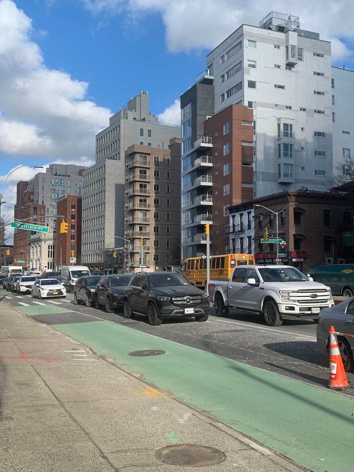
Brooklyn’s Fourth Avenue, upzoned in the Bloomberg years, has become Park Avenue’s bald, bloated cousin. Two buildings near the corner of Fourth and Carroll tell the story of shifting tastes in this “canyon of mediocrity.” 560 Carroll, finished in 2011, is tricked-out with collaged materials, balconies, canopies, and other wingdings. 243 Fourth, also known as Parlour Brooklyn, is brand-new and noticeably lacks any add-ons, wearing instead a flat array of arched windows in the Fascist mode. Both buildings are boxes that max out their zoning envelopes.
While 560 Carrol’s manic design language is of a spirit well-known and loathed by most, I suspect the performatively ascetic vibe at Parlour is more attractive to, and even liked by, most architects. But with the fundamentals of their programming and price remaining the same, a choice between the two becomes a cynical one: what flavor of $5M condominium would you prefer?
— Wes Hiatt
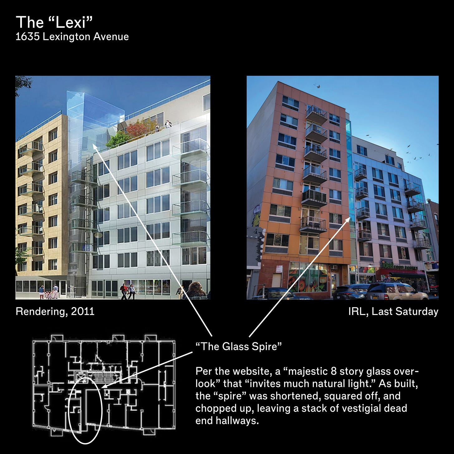
Lexington Hill Condominiums, an eight-story, 42-unit building by Gilman Architects, would be easy to mock as a caricature of gentrification. When it opened in 2013, a Wall Street Journal real estate trend piece referred to it as "stylish apartments in new developments," part of how the "fever" of redevelopment from West Harlem was coming to East Harlem. Though the units have all long since sold (and resold), it still has a tone-deaf website that abbreviates Spanish Harlem to SpaHa, shortens the building from Lexington to the "Lexi," and features a rendering with a crystalline slab of ice slicing the building which it called "The Glass Spire." The website explains that it is a "majestic 8 story glass overlook" that "invites much natural light." As built, the "spire" was shortened, squared off, and chopped up, leaving a stack of vestigial dead-end hallways.
But the building works, perhaps precisely because it fell short of its pretensions. The panelized zigs and zags are not sleek, but they do break up its size. Those dead-end hallways provide a real if estranged connection between lobby and street. Best of all, its dominant features today are what did not make that rendering: pots and furniture on the stained balconies, a piece of graffiti on its blank party wall, and the elevation's dominant feature, the sign for the ground floor grocery market, "Ideal Food Basket." Signs of inhabitation.
— Nicolas Kemper
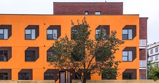
Normally dusty, it’s a bright peach when the sun hits it, saturated on the first story by a fresh coat of paint into a light-sunset orange. Lenny Kravitz’s grandmother used to live here, according to the first song the singer’s mother ever taught him. Then, from the photos I’ve found, it was an unremarkable two-story Italianate row house with white siding, originally built in 1899. Graffitied onto the side in one image, seemingly referring to 2008 housing collapse, is “It’s not a crisis, it’s a scam! Capitalism is the crisis!” Renovations were completed in the winter of 2016.
I live amid new construction, BedStuy being on the up-and-up for young-professional types. These newborn buildings’ proportions are normally awkward, material palettes quite tired, and accents either excessively bland or overly gaudy. They’re mostly bad, and occasionally comically so. The mud-brown speed lines — or Escherian pop-art — around the windows place this one in the latter category, but maybe we should reassess our value system here. Really, it’s more productive to think of this as what Mira Henry in Log 48 called “a not-famous building.” Maybe, instead of immediately dismissing these types of structures as outside the concern of respectable discourse, we need to respond more like Henry did after she surveyed her own South Los Angeles neighborhood and see some of these buildings through fresh eyes: “Look at all the style, look at all the swag. There’s a lot happening here; let’s recognize that.”
— Nicholas Raap
Cleveland’s Hingetown is named for its alleged function: it links the Detroit-Shoreway and Ohio City neighborhoods. A recent wave of investment, spearheaded by canned wine purveyor Graham “ManCan” Veysey and art philanthropist Fred Bidwell, has brought Lululemon pop-ups, artisanal pastrami joints, and, of course, looming new luxury apartment buildings with gray-and-white metal facades and Instagram-ready street art. One such building, cheekily called “Church + State” after its cross streets, towers over the neighborhood.
Hingetown is more an exercise in public relations than in architecture. Real estate developers in the neighborhood have endeavored to create a cohesive, bright, young professional brand – out with the dark-windowed gay bars and in with the white cube galleries! Maps of the neighborhood feature cute icons for the neighborhood’s pizzerias and coffee shops and are conveniently oriented so that a nearby public housing complex is tucked in a lower corner. Through new buildings with SketchUp vibes and press releases proclaiming a renaissance, the neighborhood is transforming into some new, affluent enclave — with conveniently higher rents for developers.
— Kevin Ritter
DISPATCHES
1/20: The image of architecture
At UCLA’s first winter-quarter lunchtime talk, LAURE MICHELON and TUCKER VAN LEUWEN-HALL presented a series of projects that use Machine Learning (ML) and Machine Vision (MV) to produce varied aesthetic and spatial effects. Their multi-scalar digital simulations (from object, to urban, to planetary) illustrate the broad potential applications of ML, as both a novel tool for aesthetic discovery and as a means to expand conceptual frameworks. Whether distorting, mutating, and translating images into art/ fashion objects, or processing massive datasets to extract patterns, assumptions, and speculate (at the speed and scale of climate era urban transformation), Michelson describes the automated design process as allowing us to push design “toward something that's maybe more complicated and fluid, possibly chaotic and inclusive” — something that’s more closely aligned to our contemporary condition.
— Vivian Schwab
1/20: Who runs these streets?

On Thursday, January 20, Barcelona’s Chief Architect XAVI MATILLAS AYALA and Deputy Chief Architect SÍLVIA CASORRÁN MARTOS presented Barcelona’s Superblock and Protegim les escoles (We protect schools) programs. They aim to recover streets from cars and prioritize safe, environmentally friendly spaces that encourage social interaction. With proven success from pilot projects, the next step is to scale up and generate continuous green spaces throughout the urban fabric by creating a series of superblocks while building on existing participatory planning processes.
Moderated by Urban Design Forum’s GUILLERMO GOMEZ, SEAN QUINN, the Senior Director of Bicycle and Pedestrian Programs for New York’s Department of Transportation and GÉNESIS ABREU of Futures Ignite responded with a desire to leverage the momentum from tactical initiatives during the pandemic to create systemic change both on the streets and in the decision-making process about street design. Throughout the hour, attendees voiced strong demand for New York superblocks in their own neighborhoods and discussed issues with the current Open Streets program in the chat. The cross-city exchange concluded with energy from both cities in generating collective movement toward a more sustainable streetscape.
—Poun Laura Kim
1/26: Changing the process
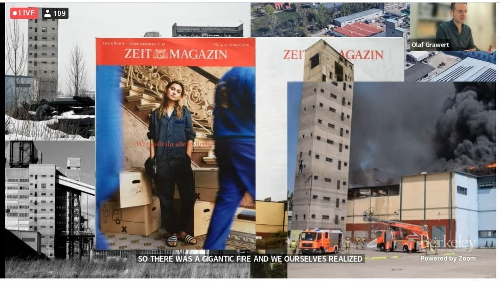
At UC Berkeley, Berlin architect ARNO BRANDLHUBER and collaborator OLAF GRAWERT explained the juxtapositions in their work at the firm b+: the built and the demolished, the luxurious and the austere. Take the Antivilla: inviting friends to help smash the windows allowed for concrete interiors drenched in generous light. Hedonism for cheap, since b+ didn't change much besides the openings of this old lingerie factory during the ‘building’ phase. Their process is “more than just the physical treatment of each building”, Brandlhuber said, “it’s the argument embedded within its process.”
At San Gimignano Lichtenburg, factory towers that were once a symbol of productivity remained only because they were too expensive to demolish. They explained that the reference to medieval Italy in its name lent the project a gravitas that allowed them to secure funding to reimagine the “cheapest place in Berlin” as a site of artistic production.
Grawert explained how b+’s site-specific work can’t be used as case study, but their process of using narratives behind it makes an argument for careful reuse.
— Sofia Gulaid
1/26: The Children of Marx and the Metaverse
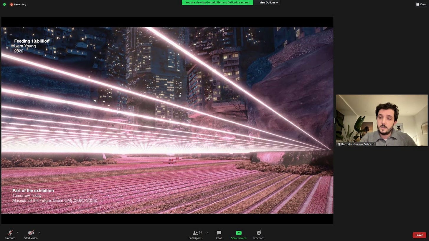
Architect and curator GONZALO HERRERO DELICADO began their lecture at Newcastle University with a photograph of Karl Marx, followed by a slide explaining the four types of alienation. Kim Kardashian, Grindr, Pinterest, and other pop culture paraphernalia flashed by on the screen. The takeaway? Technology and social media can produce bad (alienating) things, like Kim Kardashian’s terribly ugly house. But it can also produce great things, like Grindr.
At the halfway mark, the lecture turned to the metaverse. This new realm, tells us Herrero Delicado, is yet to be fruitfully explored by architects. Popular platforms like Spatial, Microsoft Mesh, and Horizon Worlds, favor familiar and unintimidating interfaces, while artist-designed digital homes like Krista Kim Studio’s Mars House fail to grapple with the possibility of digital spatial experience. “From an architectural point of view,” said Herrero Delicado, it’s very elemental.
If Farrell Centre director OWEN HOPKINS’s introduction set a tone of expectation for momentous ideas in a momentous time, Herrero Delicado’s lecture delivered a polite Burkean conservatism punctuated with labored, progressive-sounding provocations.
— Sebastián Lopez Cardozo
EYES ON SKYLINE
(most-clicked link from 53)
Lots of you wanted to learn more about the Graham-grantee project Confronting Carbon Form.
IN THE NEWS
On Long Island, a house designed by Marcel Breuer was demolished without warning…
…the New York Times daringly asked its readers if they could identify a city based on abstract photography of its architecture…
…United States Artists announced five fellows in its Architecture and Design category…
…Oakland’s historic Rotunda building finally has a new owner, though no news as to its potential fate yet…
…farther down the California coast, Alissa Walker reports that Los Angeles has ended its free-bus-fare policy, a measure that started with the pandemic…
…and our call for designs for a 100% affordable 5 WTC made The Village Sun! Deadline is February 12: register here.
DATELINE
The architecture schools belatedly begin their lecture series...
Thursday, 1/27
Liz Diller: Recent Work
6:30PM | Yale University School of Architecture
Saturday, 1/29
How to: not become a “developer” with Harriet Powell, Mingjia Chen, Rebekka Hirschberg, Duncan Steele, Thea Renyong, Ewa Effiom, CoCo Tin, Melanija Grozdanoska
12:00 PM | Canadian Centre for Architecture
Monday, 1/31
Space Popular: “Portal Galleries” with Lara Lesmes, Fredrik Hellberg
6:30 PM | UCLA Architecture and Urban Design
Wednesday, 2/2
Towards Another Architecture with Ruth Morrow
12:30 PM | The Farrell Centre
Culture, Community, and Environmental Justice in Contemporary Indigenous Design with Sam Olbekson
6:30PM | Harvard GSD
Art as Measure of Civilization: An Ottoman Perspective with Zeynep Çelik
6PM | Yale University School of Architecture
Friday, 2/4
FF – Distance Edition: Studio Roberto Rovira
12:00 PM | The Architectural League of New York
Attention no.6 Launch, "Community is a Practice" with Anna Goodman, Molly Esteve, Curt Gambetta, Joseph Bedford
7:00 PM | Portland State University
LETTERS TO THE EDITOR
Would you like to share your thoughts? Please write to us. Simply reply to this e-mail or write to us at editor@nyra.nyc.
Four desk editors run NYRA: Alex Klimoski, Phillip Denny, Carolyn Bailey & Nicolas Kemper (who also serves as the publisher).
To pitch us an article or ask us a question, write to us at: editor@nyra.nyc.
For their support, we would like to thank the Graham Foundation and our issue sponsors, Tod Williams Billie Tsien Architects and Thomas Phifer.
To support our contributors and receive the Review by post, subscribe here.

